When Data Visualization turns into Accidental Art
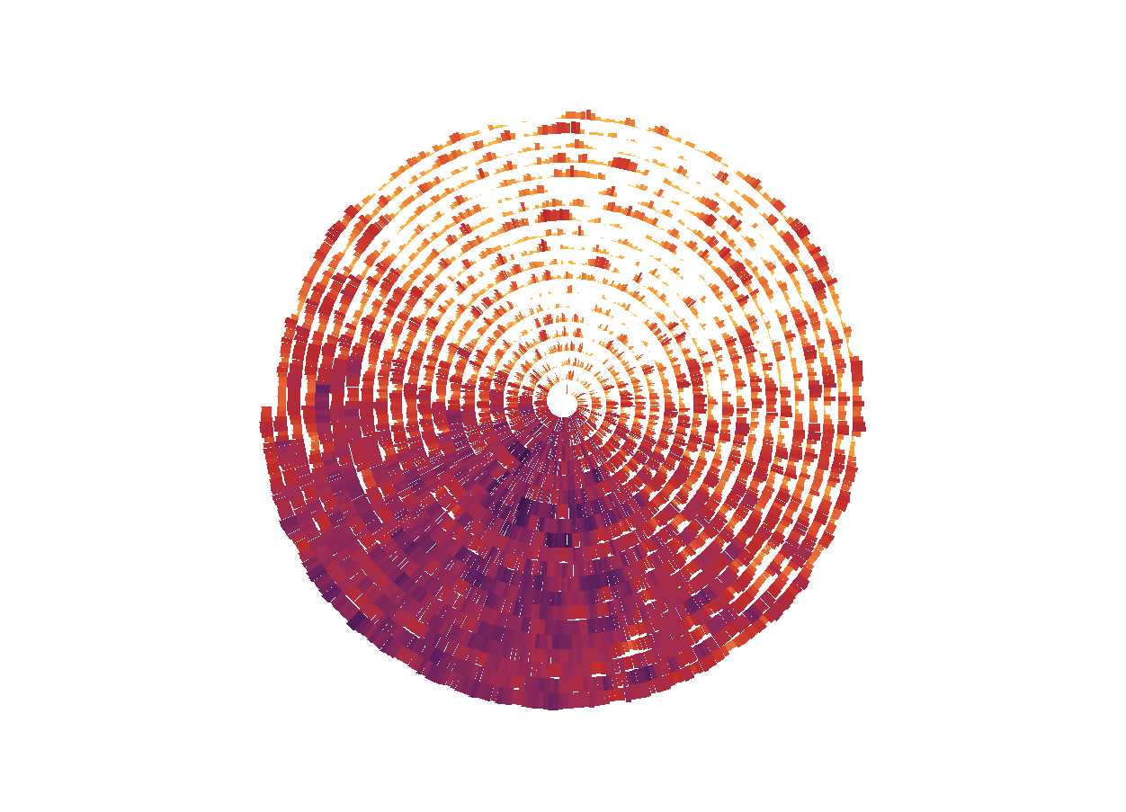
Have you ever set out to visualize data but ended up creating something that looked more like art? It happened to me recently while I was working with R and ggplot2 to generate some visualizations for a client. I can’t reveal the specifics of the data, but the result was a series of colorful spirals that turned into something I couldn’t resist admiring—a blend of insights and unexpected beauty.
Data visualization is generally about extracting meaning from raw numbers. It’s about communicating trends, patterns, and stories in a way that is clear, insightful, and actionable. But sometimes, it’s more than that. Sometimes it’s about stumbling across the kinds of shapes and forms that make you take a step back, tilt your head, and say, “Wait a second, did I just make art?”


It’s a funny thing when your code and data visualization work leads you to a moment like this. One minute, you’re struggling with your data—perhaps wrangling a stubborn column or nudging the position of some labels—and the next minute, you run your code, and something stunning emerges on your screen. It’s a moment that makes all the trial and error worthwhile. And that’s exactly what happened here.
When working on this client’s data, I found myself getting lost in the spirals of colorful segments, adjusting colors and playing with polar coordinates to arrange the data in concentric circles. Suddenly, I realized that what I had made wasn’t just a visualization, it was something visually striking, something that resembled a work of modern art. It felt less like an analysis tool and more like an abstract masterpiece—complete with the satisfying imperfections that make generative art so captivating.
It reminded me of the dual nature of data visualization: on one hand, it’s a skill that combines design and technical chops to answer questions and explain data. On the other hand, it can be an inherently creative act. You’re curating colors, forms, and layouts, using mathematics and geometry—and every now and then, you surprise yourself with a piece that blurs the lines between data and art.
I think these moments are a testament to the beauty of the process itself. Data analysts and visualization specialists like me spend a lot of time in the weeds—writing code, wrangling messy data, making adjustments until something just clicks. Most of the time, the goal is clarity, simplicity, and effective communication. But every now and then, the outcome goes beyond function—it has beauty. It’s a happy accident, a by-product of the same meticulous effort you put into all your visualizations.
I’m definitely not claiming that I’m the next great abstract artist—but I think there’s a real joy in discovering beauty in unexpected places. If you’re a data analyst or someone who works with visualization, I encourage you to lean into these moments. Take a pause to appreciate the way your data, your algorithms, and your creativity have combined to make something lovely. If you’re lucky, your next visualization might not just deliver insights—it might also be a little work of accidental art.